The Challenge
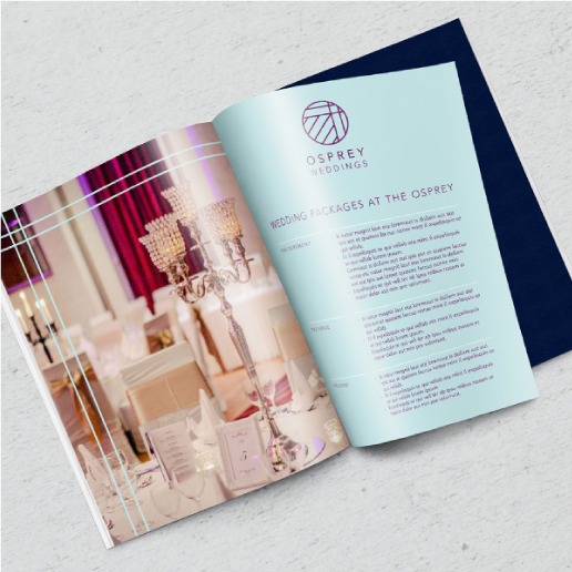
Osprey Hotel is a hub of activity just outside Naas town centre in Co. Kildare. The extensive grounds are home to a unique hotel, bar and restaurant, a luxurious spa, leisure centre and conference centre. The hotel also caters for weddings and events as well as corporate and family packages.The Pudding embarked on a rebrand journey with the hotel. Osprey required an identity which would align all of these aspects of the hotel but also allow each of them to live and breathe individually.

Process
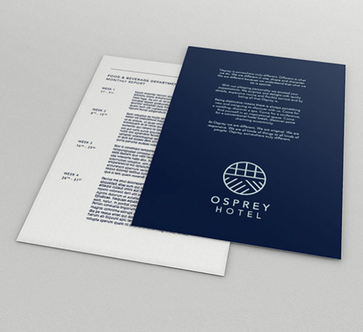
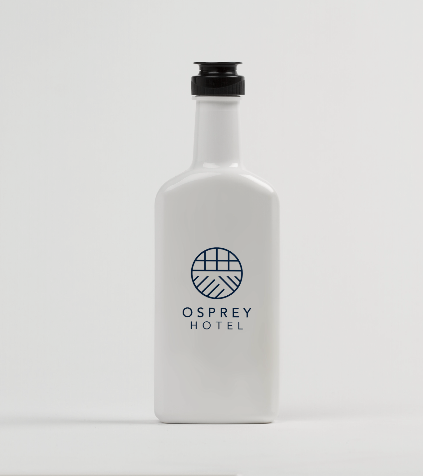
Our design process began by examining the distinctive architecture of the building. We identified many different angles and shapes that were characteristic of each facet of the Osprey Hotel. The logo has been specially crafted to reflect the inherent qualities of the Osprey Hotel Brand: “We are not regular in size, shape or character.”
These different lines were placed within a shape that represents the Osprey, a circle. This balanced shape is offset by dynamic lines. The Osprey Hotel logo is created from a combination of aspects from each of the sub-brand logos. The overall aim for the visual identity was to create a visual aesthetic that reflected the 4 star quality of the hotel. The minimal clean lines of the identity denote confidence, clarity and direction. The colour palette plays an integral part in the identity. Inspired by the existing decor of the hotel, it retains a sense of legacy to the previous identity while also providing a mode of identification for each of the sub-brands.

Impact
Overall this identity is modern and fresh and it successfully aligns the varying aspects of the Osprey Hotel brand. The identity is essentially a flexible framework which the hotel can expand upon over the years if they so desire. The visual identity for Osprey Hotel was chosen as a Finalist for the 2017 Institute of Designers Ireland Awards.
