The Challenge
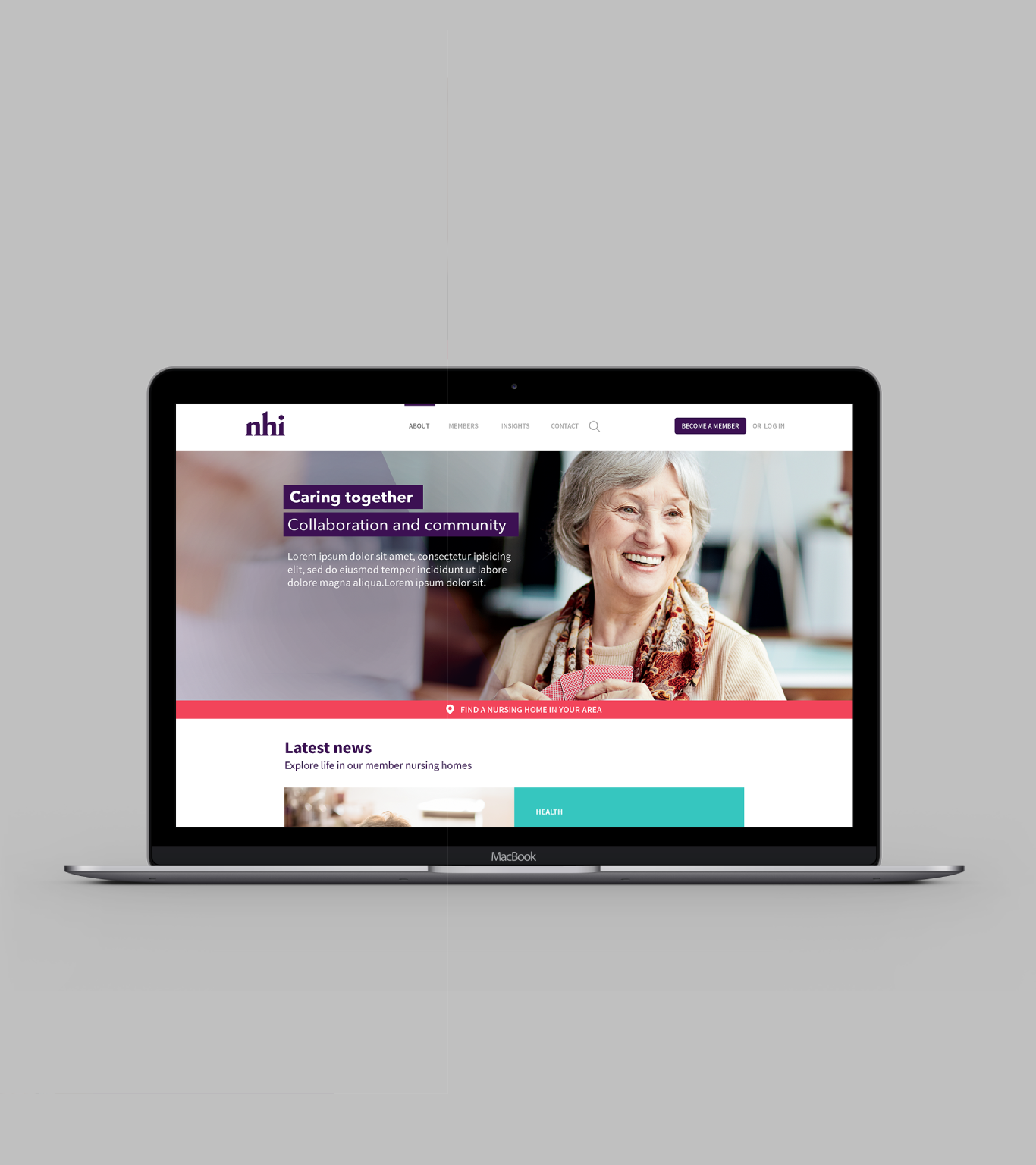
Nursing Homes Ireland wanted to re-position and re-centre their brand to better represent their core purpose and communicate their values and mission. A great brand will differentiate them in the minds of all their stakeholders. It will create positive advocates and change the negative perception of nursing home care in Ireland.
Irish nursing home care has become a complex and contentious issue in recent years with the traditional approach of care coming in for a lot of criticism. In response, a change in care culture to a person-centred approach has been growing steadily in popularity, focusing on placing resident care in their own hands, effectively giving them the ability to decide how they wish to be cared for.
NHI is driving this change by actively supporting their members, enabling them to provide sustainable, high quality care to 18,500 residents in 374 private and voluntary nursing homes.

Community
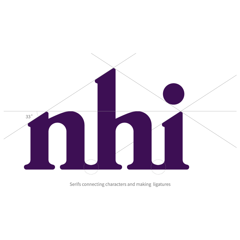
NHI’s logomark is constructed to show the connection between each line and element. It has tightly bound ligatures that create a sense of unity.
Positive Future
The logo has an upward projection, with the characters pointing upward to reflect NHI’s contribution to shaping a more progressive model of care – as well as the evolution of their organisation as a whole.

Brand Identifier
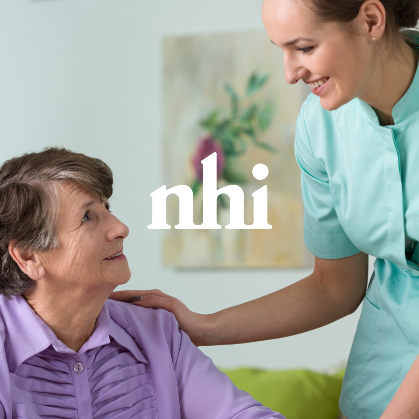
NHI’s brand identifier allows them to be expressive within a simple visual system. At its essence, it represents a simple hug, perhaps between carer and resident.
The design itself was inspired by the chemicals released when two people embrace. This brand expression can be used throughout all internal and external communications. This constantly reminds us of their core purpose: supporting the delivery of care.

Brand Identifier Macro
NHI’s visual language is also supported by a graphic macro device. The macro device can be applied as a visual tool for campaigns, promotional literature and other platforms.
