The Context
Lynoslife is an international life sciences company centred on adding value to how people feel, look and live. With world-class capacity, technology and expertise, the team is focused on expanding its health, wellbeing and pharmaceutical products and services.
Lynoslife approached us as Cosmetic Creations, a contract formulation and manufacturing company based in Mayo and Cork. They specialise in the creation of cosmetics such as skincare, self-tanning, personal care and bodycare products as well as wellness-enhancing food supplements and medical device applications. Cosmetic Creations produces both third party brands and own brands, having successfully launched their Airmedica brand of sanitizer during the pandemic. Cosmetic Creations wanted to move their brand away from ‘cosmetics’. They do cosmetics, but so much more too. We were tasked with creating a brand that would truly represent and help them to bring their purpose and client experience to life.

The Brief
Our brief started with a creating a new name for Cosmetic Creations. There are five ‘blue zones’ on Earth; parts of the world where people live the longest and tend to have better physical and mental health. The blue zones are: Icaria in Greece; Okinawa in Japan; Sardinia; Loma Linda in Calif and Nicoya Peninsula in Costa Rica. Living well is about more than just health, it’s a lifestyle choice. Focused on bringing to life the company’s purpose of adding value to how people feel, look and live better, the name Lynoslife was inspired and evolved from taking the first letter from each of these locations and adding the word ‘life’. Beyond beauty, Lynoslife want to inspire this ethos in everyone who uses our products. They live their purpose in everything they do. In this context, we pitched Lynoslife as so much more than a brand; more a philosophy for life.
The Creative
Lynoslife take their clients from the simplest of ideas and blueprints, to shape and create exciting products. Reflecting this journey, our visual identity framework itself is a blueprint for creation.
The Lynoslife logomark has a modern yet strong capitalisation typesetting with an intriguing yet decisively marked O. The O contains a tilted stroke that runs from behind to front reflecting the history and DNA of the organisation and it’s constant evolution. The tilted stroke reflects the angle of Earth’s tilt as it orbits the sun. It symbolises the organisation’s ability to cut through complexities, to create products that add value to how people feel, look and live around the world. Our colour palette was inspired by the natural and man-made colours appearing in aerial shots of Lynoslife’s manufacturing plants in Mayo and Cork. Green and grey hues form the primary palette. The secondary palette contains heritage, global and mint greens paired with a warm and exciting coral colour. This colour brings energy and vibrancy to the brand reflecting the resilient braveheart attitude that sits as one of the team’s core values.
Visual Language
Our visual language for Lynoslife is inspired from how the organisation shapes, builds and creates products. It takes inspiration from The Seed of Life which is a universal symbol of creation and one of the first visual markings of life on earth. The Seed of Life is life’s DNA. All forms of life as we know flow from these natural geometric patterns. Like the fractal patterns in a snow flake, we can see these patterns everywhere, in both nature and manmade materials throughout the world. Like this Seed of Life, Lynoslife bring ideas to life in a structured yet creative and inspiring way, impacting the lives of people everywhere. With this in mind, our visual language is made up of a structured grid of symbols representing both the ingredients for creation (an idea, collaboration, innovation etc.) and the outcomes (feel, look, live etc.). This creates a true canvas or blueprint for creation.
The Activation
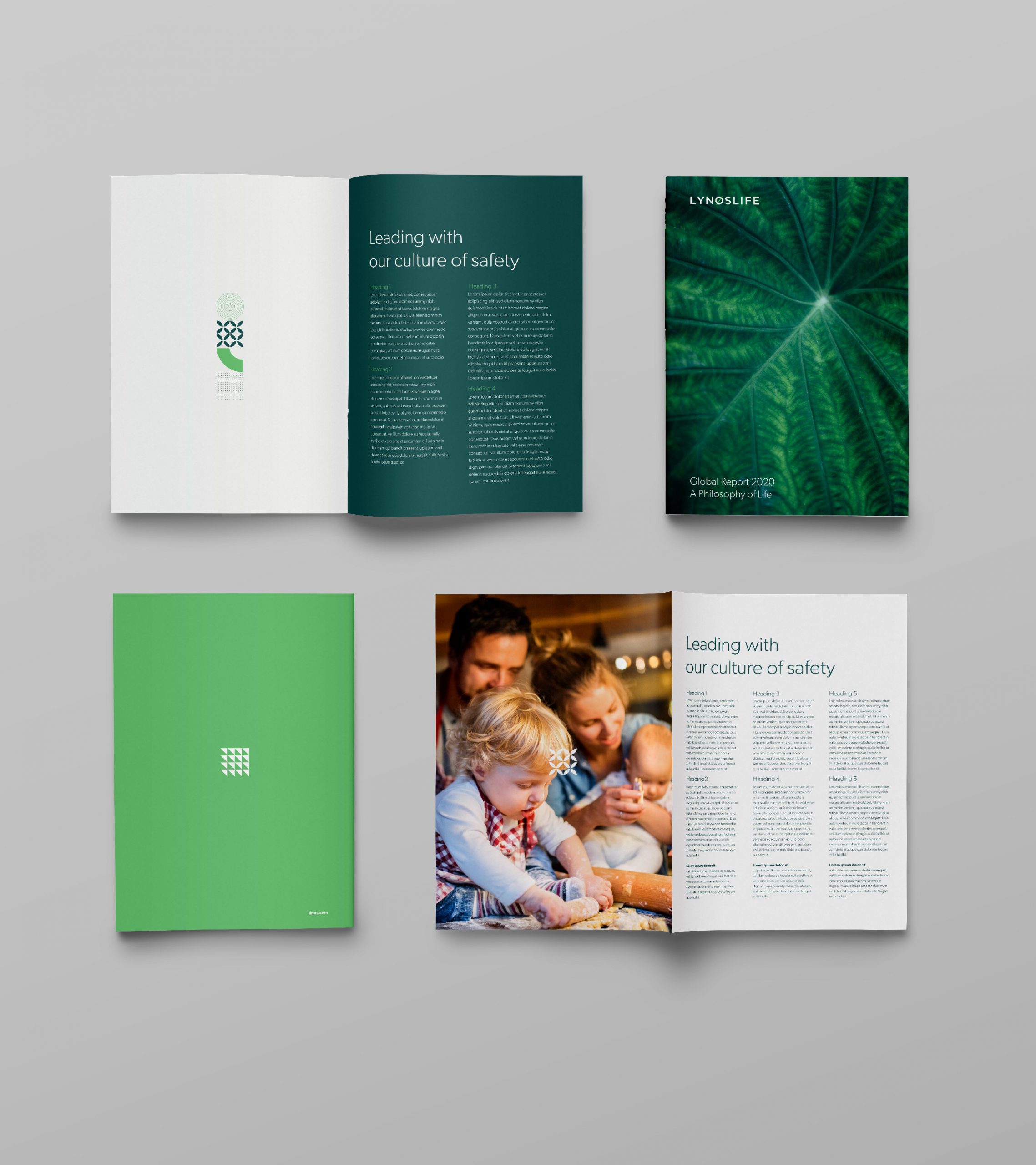
Activations of the brand, bring all the elements of our visual framework together to bring the brand to life across multiple channels. Photography is central to this activation. Inspired by the original markings of creation of human life, the first of our photography route looks to natural geometric formations that inform our very existence. These patterns are abstract in aesthetic yet dynamic, inspirational and magnificently beautiful. Simply, mother nature at its best.
Beyond the beauty, Lynoslife want to inspire their ethos in everyone who uses our products to build and shape their lives for the greater good. The team lives this purpose in everything they do, from our products to our people, to our clients, partnerships and to our communities. Our second photography route captures the organisation’s philosophy for life by showing real people in real situations having a positive impact on their own lives and the lives of others.
Overall, this dynamic brand brings to life a truly exciting purpose.